Where does illustrator end, and infographer begin? How does data visualization fit in? And what does science have to say about the design decisions we make? With the goal of strengthening connections between communities, Jen hopes to get folks thinking about what they can learn from — and teach to — different visual sub-disciplines within the broader orb of science communication.
We are excited to learn about the role of science illustration in data visualization as we continue to feature our virtual exhibition of science illustration, The Art of Nature.
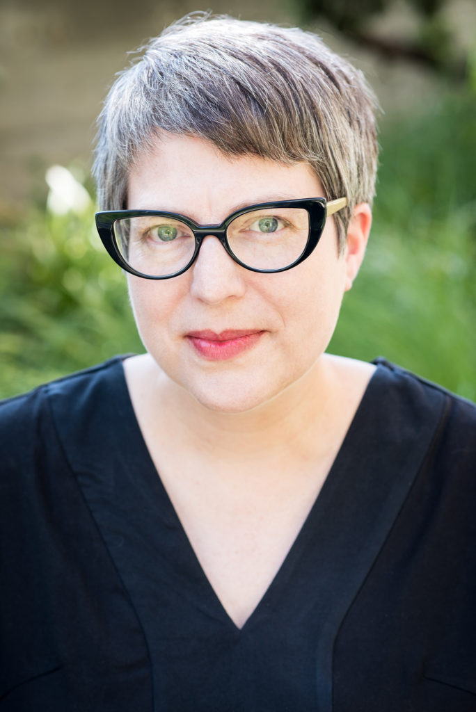
About the speaker: Jen Christiansen is senior graphics editor at Scientific American, where she art directs and produces illustrated information graphics and data visualizations. She completed undergraduate studies in geology and art at Smith College, then happily merged the two disciplines in the scientific illustration graduate program at UC Santa Cruz. She began her publishing career in NY at Scientific American in 1996, moved to DC to join the art department of National Geographic, spent four years as a freelance science communicator, then rejoined the SciAm team in 2007. She writes on topics ranging from reconciling her love for art and science, to her quest to learn more about the pulsar chart on Joy Division’s Unknown Pleasures album cover.
http://jenchristiansen.com/
https://blogs.scientificamerican.com/sa-visual/